form 表单默认的样式比较丑陋且不能更改,那么我们有什么简单快捷的办法优化他们呢
# 优化思路
这时就要引入一个比较重要的标签label 和一个比较重要的概念伪类就可以完成我们的优化工作了
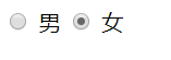
# 优化 radio
优化前
优化后
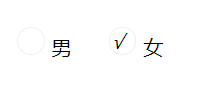
好吧看上去还是那么丑,但我们知道了这些标签也是可以优化和自定义的,那剩下的就是写 css 喽!
优化代码:
<div class="box">
  <label class="radioLab">
    <input type="radio" name="sex" id="" />
    <i class="icon"></i>男
  </label>
  <label class="radioLab">
    <input type="radio" name="sex" id="" />
    <i class="icon"></i>女
  </label>
</div>
 <style>
    .box {
    width: 300px;
    height: 300px;
    margin: 60px auto;
    }
    .box .radioLab {
    position: relative;
    }
    .box .radioLab input[type="radio"] {
    opacity: 0;
    }
    .box .radioLab .icon {
    display: inline-block;
    width: 20px;
    height: 20px;
    border-radius: 100%;
    border: 1px solid #eee;
    margin-right: 5px;
    }
    .box .radioLab input[type="radio"]:checked + .icon::after {
    position: absolute;
    content: "√";
    }
</style>
TIP
原理就是,首先使用 opacity: 0; 将 input 元素 “隐藏” 起来,利用 label 标签的特性,在点击时将 input 元素选中或取消选中。 i 元素结合伪类模拟单选框 radio 点击的样式
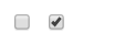
# 优化 checkbox
优化前
优化后
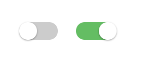
优化代码
<div class="box">
  <label class="checkboxLab">
    <input type="checkbox" name="love" id="" />
    <i class="icon"></i>
  </label>
  <label class="checkboxLab">
    <input type="checkbox" name="love" id="" />
    <i class="icon"></i>
  </label>
</div>
.box {
  width: 300px;
  margin: 100px auto;
}
.box .checkboxLab {
  position: relative;
}
.box .checkboxLab input[type="checkbox"] {
  opacity: 0;
}
.box .checkboxLab .icon {
  display: inline-block;
  width: 58px;
  height: 28px;
  border-radius: 20px;
  background: #ccc;
}
.box .icon {
  background: #ccc;
}

.box .checkboxLab input[type="checkbox"] + .icon::before {
  content: "";
  width: 28px;
  height: 28px;
  left: 22px;
  position: absolute;
  transition: left 0.3s;
  border-radius: 20px;
  border-top-left-radius: 20px;
  border-top-right-radius: 20px;
  border-bottom-left-radius: 20px;
  border-bottom-right-radius: 20px;
  background-color: #fff;
  box-shadow: 0 1px 3px rgba(0, 0, 0, 0.4);
}
.box .checkboxLab input[type="checkbox"]:checked + .icon {
  background-color: #64bd63;
  transition: border ease 0.4s, box-shadow ease 0.4s, background-color ease 1.2s;
}
.box .checkboxLab input[type="checkbox"]:checked + .icon::before {
  position: absolute;
  content: "";
  width: 28px;
  height: 28px;
  background: red;
  border-radius: 100%;
  left: 60px;
}